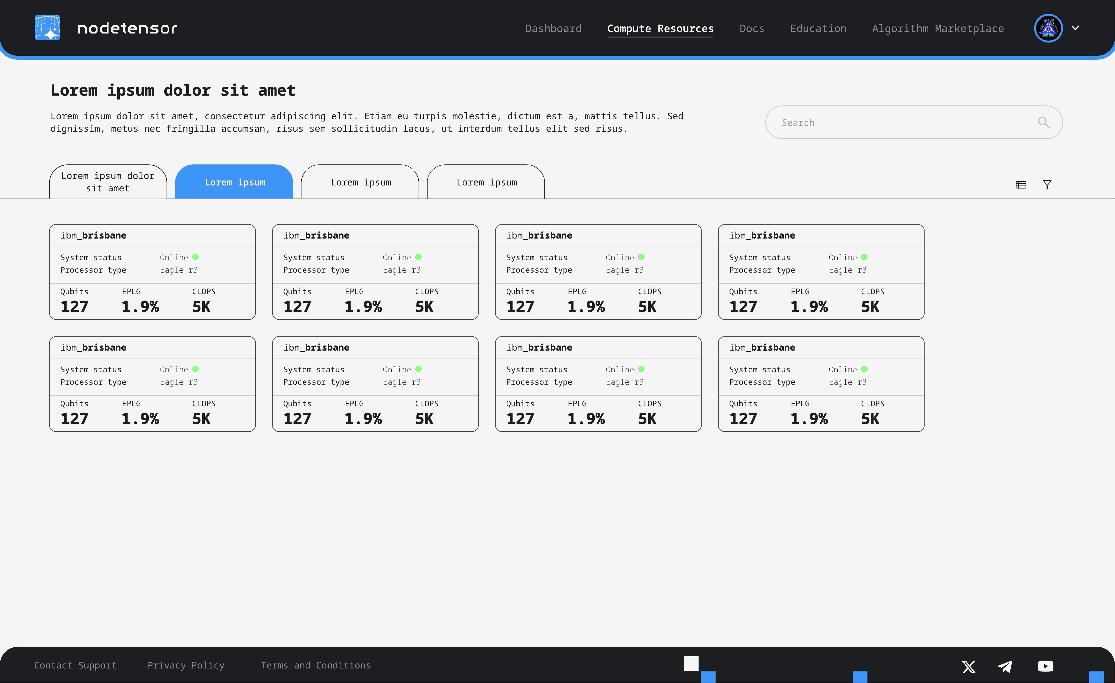
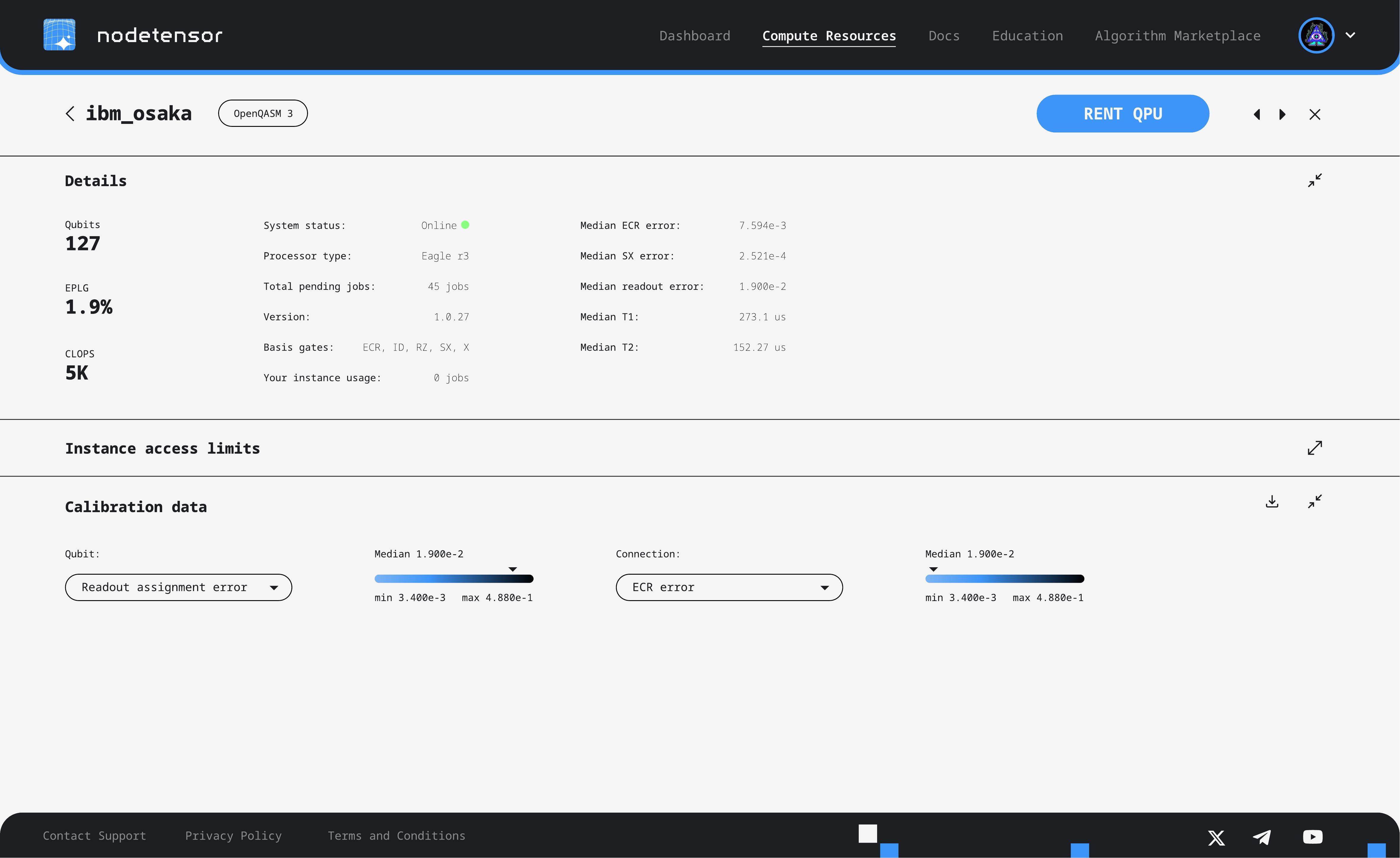
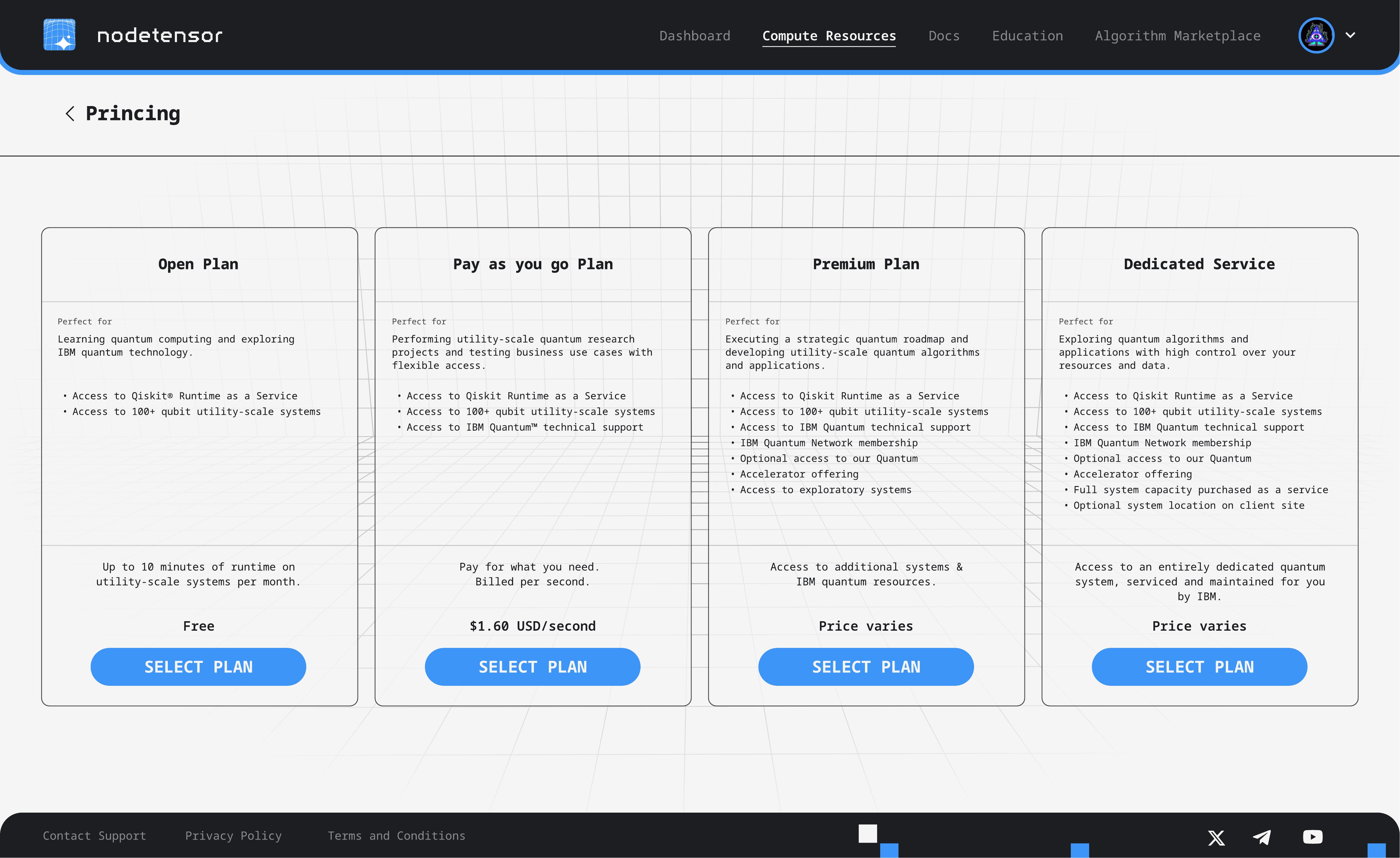
NodeTensor is a decentralised gateway to blockchain-powered quantum computing. The platform lets researchers and developers browse quantum processors, rent compute time, and manage their usage, all through a web interface. They needed a complete application design that made deeply technical infrastructure feel approachable.
The challenge was twofold. The subject matter is inherently complex (qubits, error rates, calibration data), and the target audience ranges from PhD researchers to business users exploring quantum for the first time. The design needed to serve both without softening the technical surface.
The application shipped as the live NodeTensor platform.
Setting the visual identity
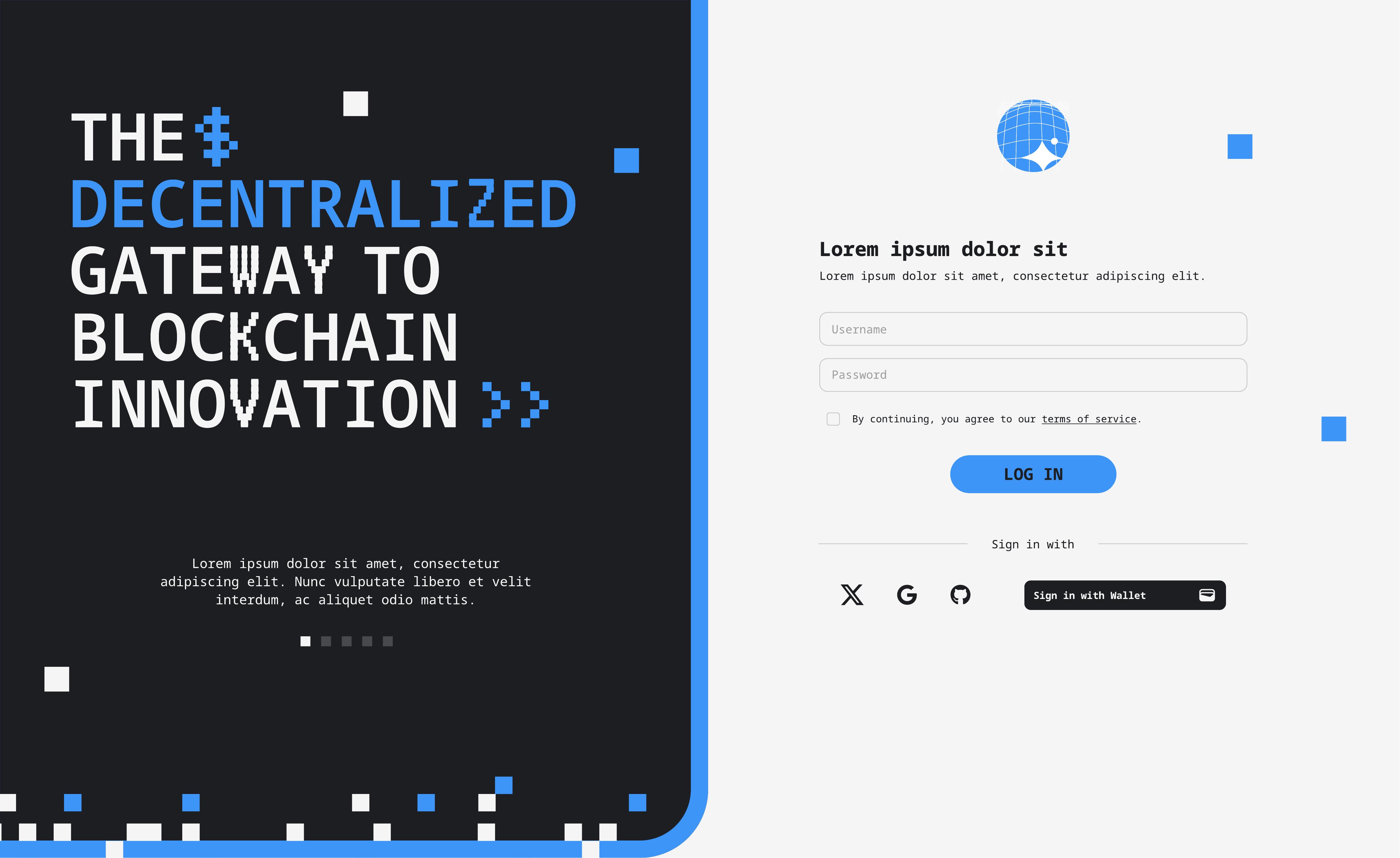
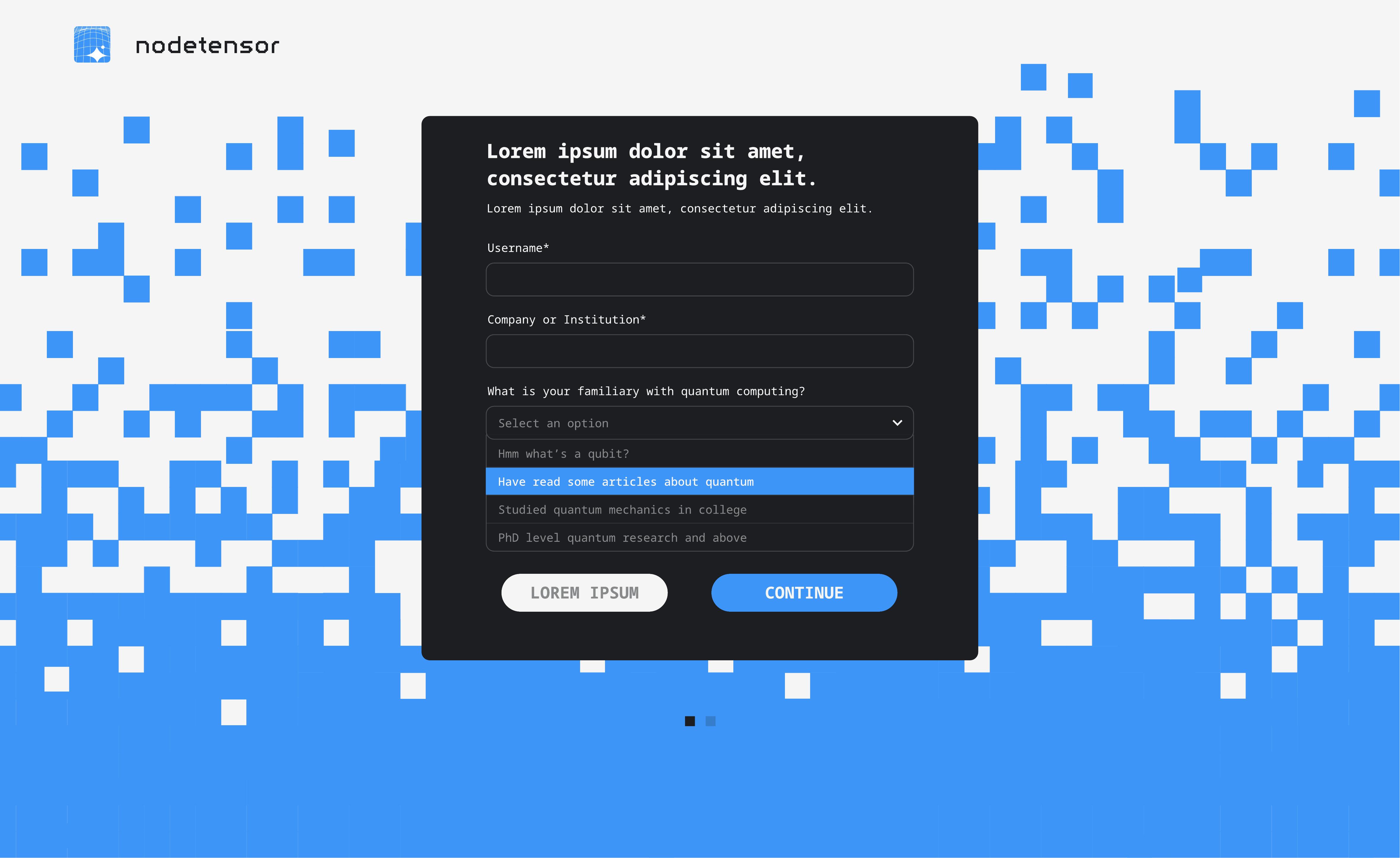
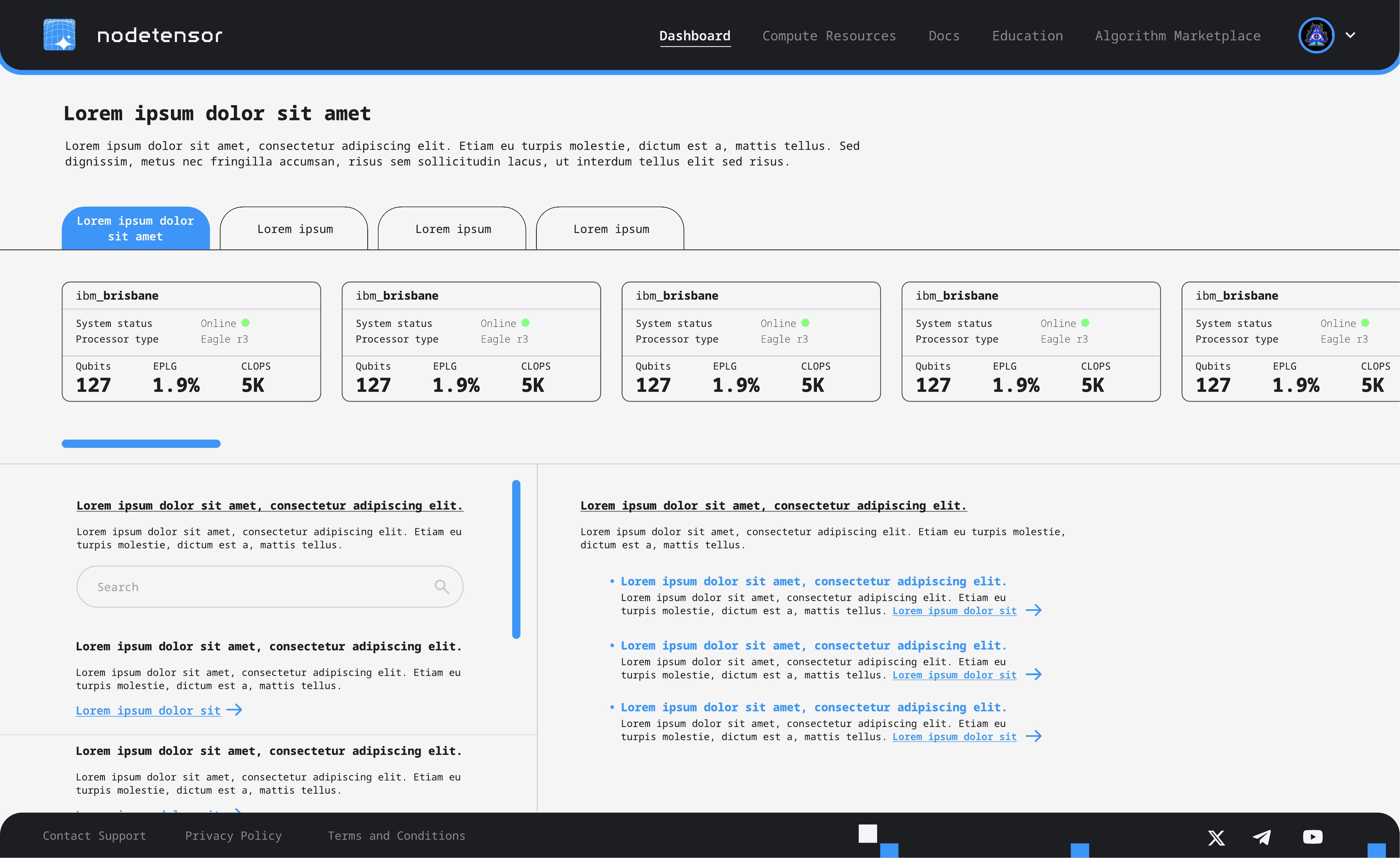
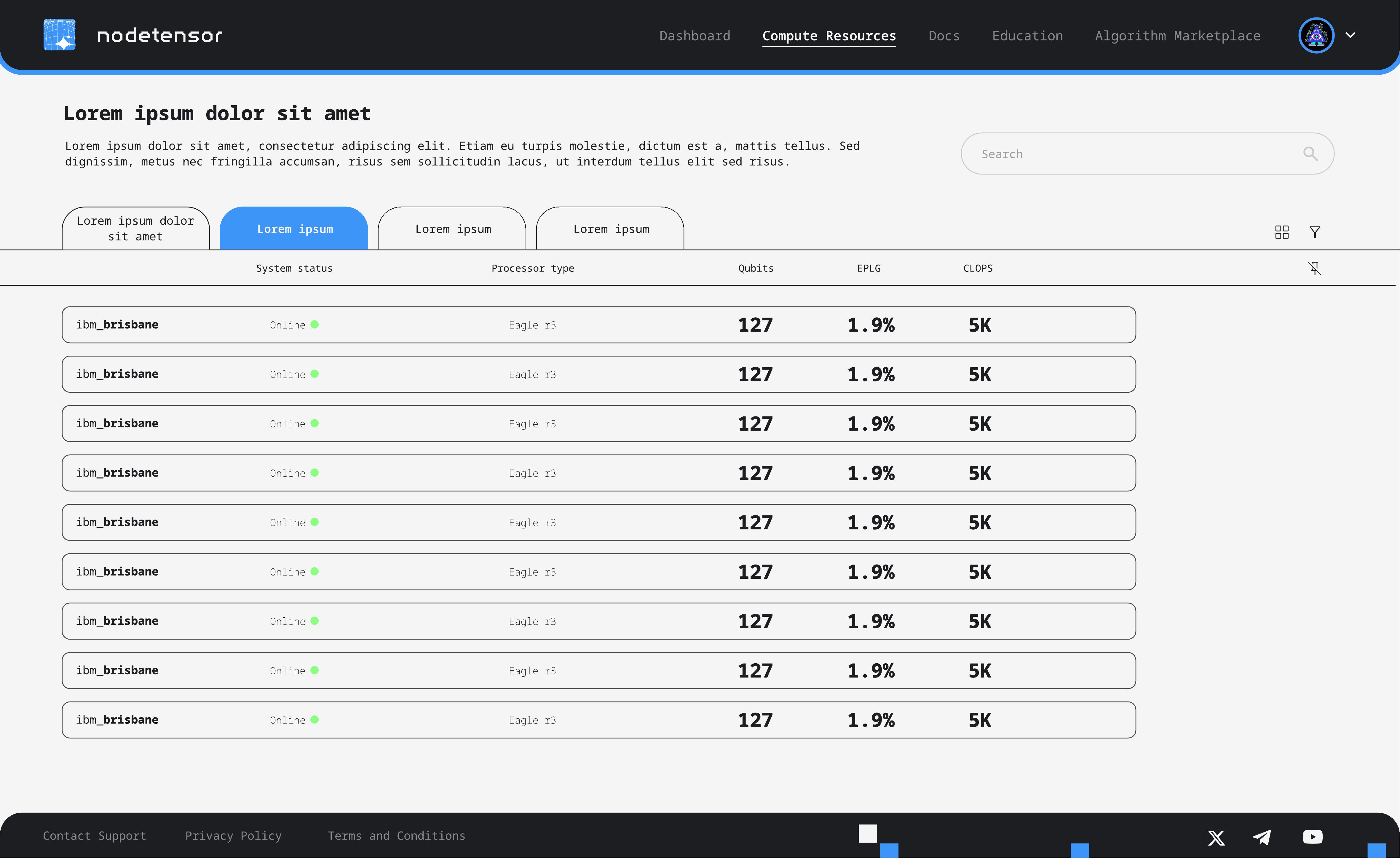
The visual language draws from the intersection of technology and precision. A monospace typeface anchors the interface in the technical world without feeling cold. The colour palette is restrained (mostly black, white, and grey) with blue as the single accent colour for interactive elements and key data points.
Pixelated block patterns. The most distinctive design element is the scattered pixel-block motif that appears across backgrounds and transitions. These aren't decorative. They reference the discrete, quantised nature of quantum computing itself. Blocks appear in blue and black, sometimes sparse, sometimes dense, adapting to each screen's context.
Dual themes. The login and onboarding flows were designed in both light and dark variants. The light theme uses a clean grey background with subtle block accents. The dark variant inverts this with a bold blue pixelated background, giving the platform a more immersive, technical feel. Both were delivered so the client could test which resonated better with their audience.