Building a Brand That Hits as Hard as the Workout

Website and brand design for Be Strong — a CrossFit gym building better humans

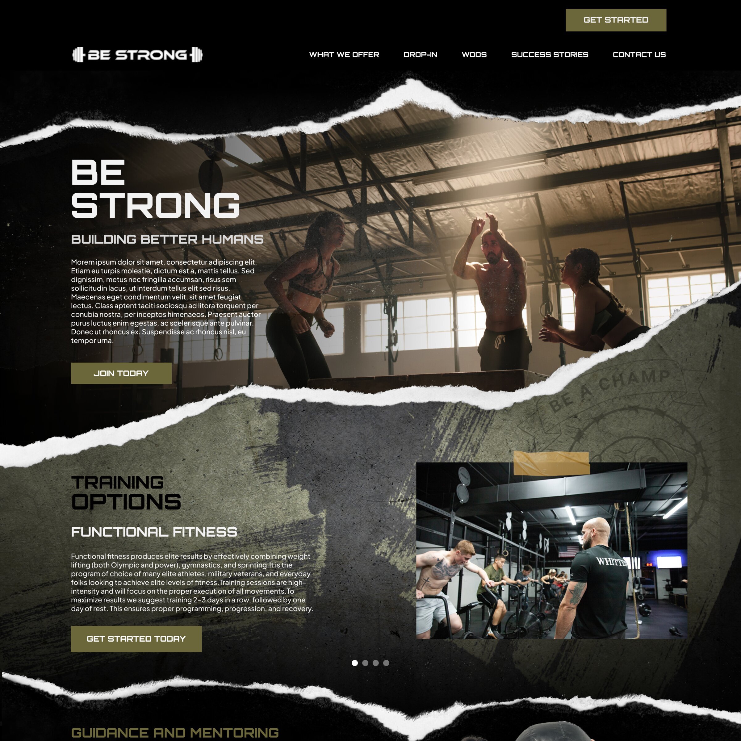
Be Strong is a CrossFit gym with a clear philosophy: building mental and physical strength through healthy habits. They needed a website that communicated intensity and commitment — not the polished, aspirational aesthetic most fitness brands default to.

The brief was straightforward: design a home page and key inner pages that feel as raw and physically demanding as the workouts themselves. The brand should attract people who are serious about training — not browsing.

"Building Better Humans" Be Strong's mission — and the foundation for every design decision

Finding the visual language
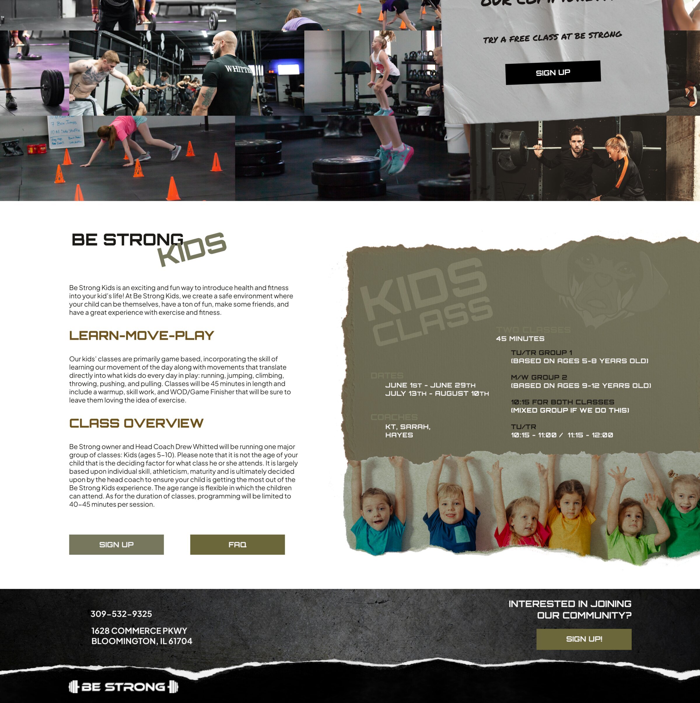
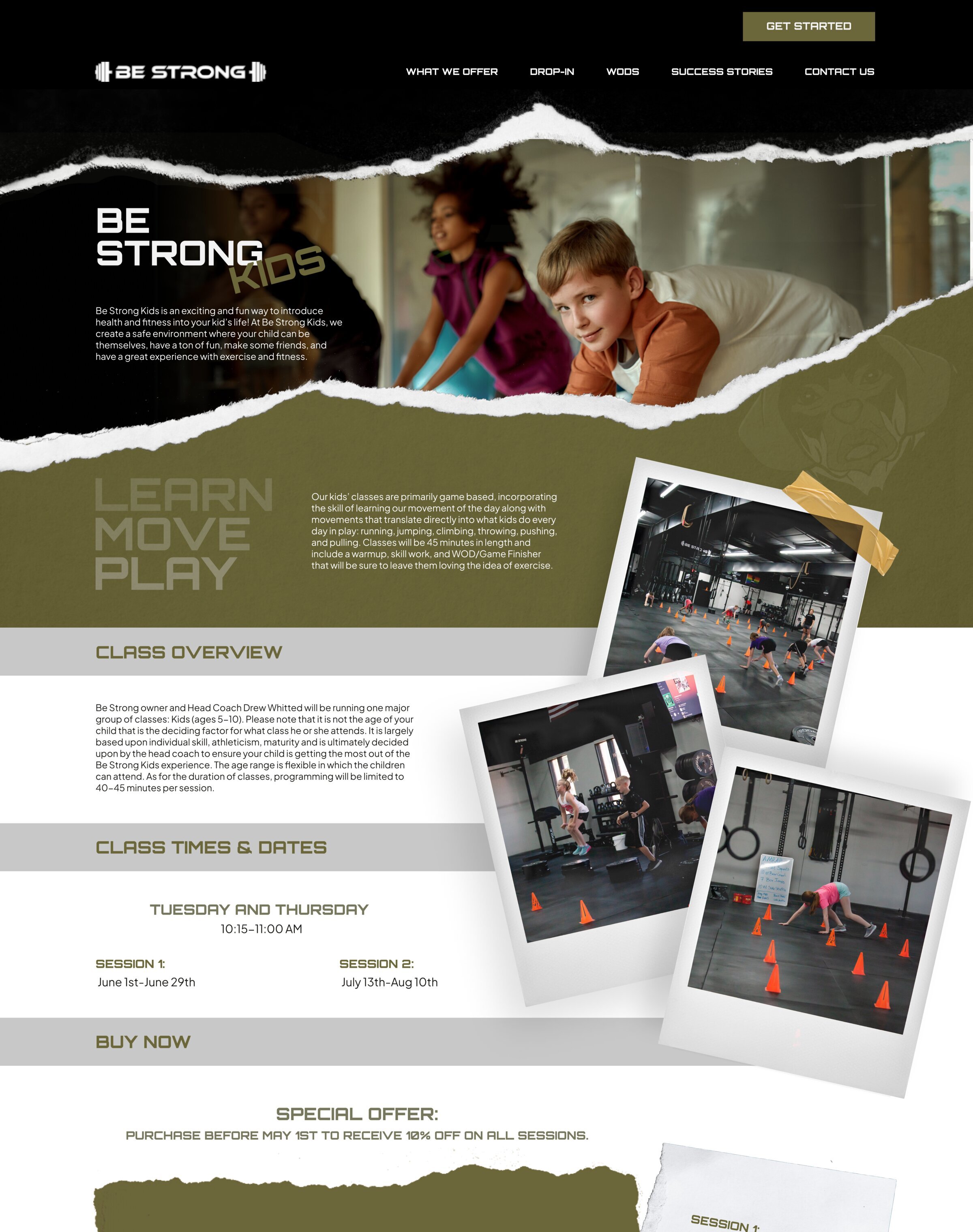
The starting point was a question: what does intense physical effort actually look like? Not the clean, minimal gym aesthetic you see everywhere — but the grit. The chalk dust. The torn calluses.

That led to three core visual elements that defined the entire design system:

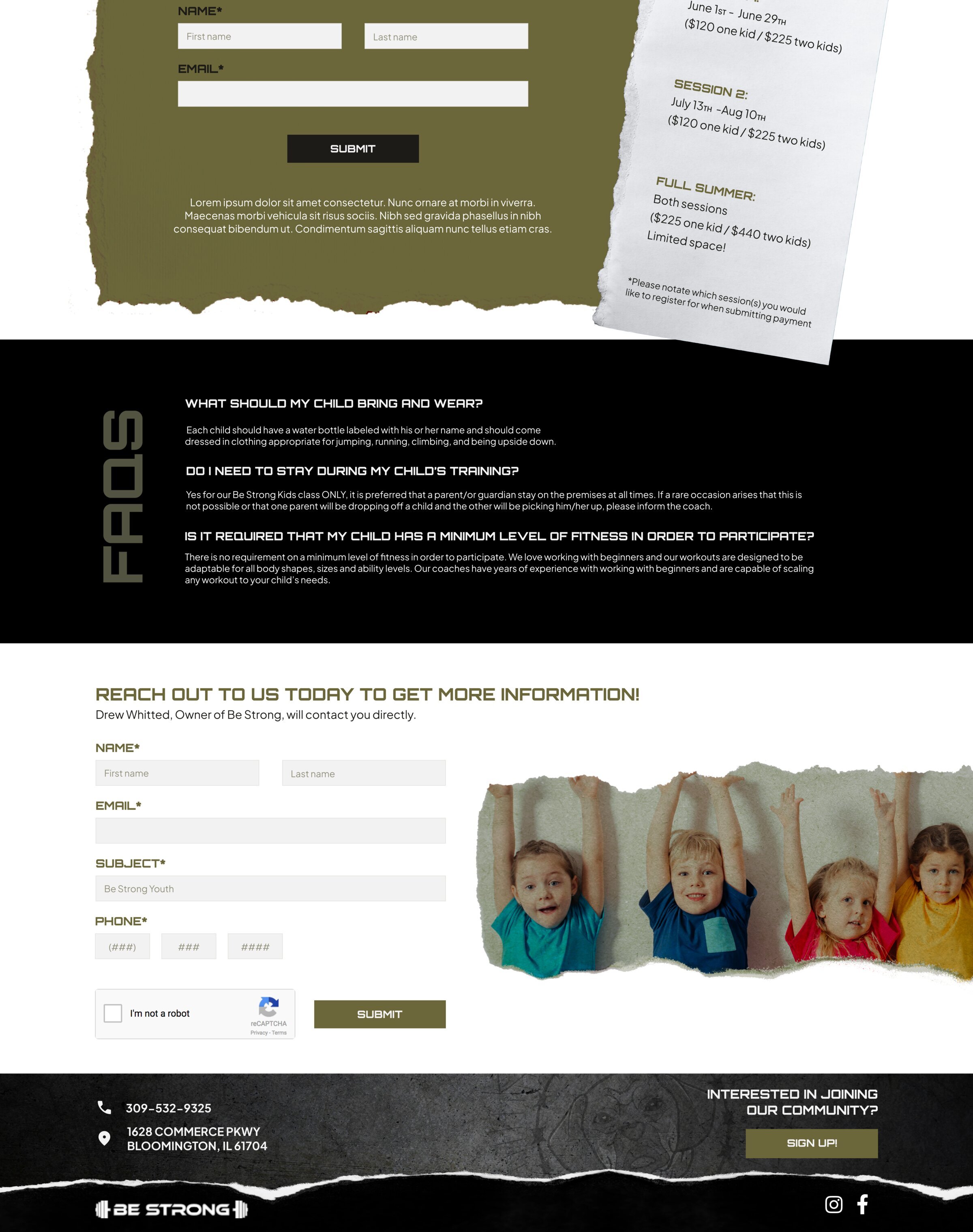
Ripped paper edges. Every section transition uses torn paper textures instead of clean dividers. It breaks the layout in a way that feels physical and deliberate — like something was pulled apart by hand.

Concrete and raw textures. The backgrounds draw from warehouse walls and gym floors. Dark, heavy, unapologetic. This isn't a spa; it's a place where work gets done.

Brushstroke typography. Bold, hand-painted lettering for headlines reinforces the human, physical quality of the brand. Nothing about Be Strong should feel machine-generated or sterile.

Be Strong homepage — dark navigation bar, ripped paper edges, 'Building Better Humans' headline over CrossFit gym photography, and training options section

Designing the homepage

The homepage needed to do two things: hit hard on arrival, and guide visitors toward signing up without feeling like a sales funnel.

The hero section opens with a full-bleed gym photograph — athletes mid-workout, silhouetted against industrial lighting. The ripped paper edge tears across the bottom, immediately signalling that this isn't a template site. The "Building Better Humans" tagline sits in bold brushstroke type, anchoring the brand promise above the fold.

Below the hero, the page flows through training options, guidance and mentoring, and membership pricing — each section separated by those torn paper transitions. The olive and gold palette keeps things grounded and masculine without feeling aggressive. Photoshop was a key tool in achieving the layered texture effects that give every section its depth.

Be Strong guidance and mentoring section with coach testimonial, membership options, and The Proven Processes brand diagram

The mid-section introduces the coaches and the gym's methodology — "The Proven Processes" — through a brand diagram that ties nutrition, training frequency, and mindset into a single visual. The testimonial section uses oversized quotation marks and a coach portrait, keeping things personal. Membership options are presented simply — day, week, month, year — without overwhelming the visitor with pricing tables.

Be Strong community sign-up section, footer with contact details, and transition into the Be Strong Kids programme pages

Extending the brand: Be Strong Kids

Be Strong also runs a children's programme — "Learn, Move, Play" — which needed its own pages without losing the parent brand's identity. The challenge was making the kids section feel welcoming and fun while still clearly belonging to the Be Strong world.

The solution was to keep the same structural language — ripped paper edges, dark navigation bar, bold typography — but soften the palette slightly and swap the intense workout photography for images of children being active and playful. The olive tones warm up, the brushstroke headlines stay, and the torn paper transitions carry through. It feels like the same gym, just a different room.

Be Strong Kids programme — hero with children, Learn Move Play headline, class overview with polaroid-style activity photos, and session schedule

The kids pages use polaroid-style photo frames for the activity shots — a small detail that softens the industrial aesthetic and adds a playful, scrapbook quality. Class schedules, session dates, and pricing are laid out clearly, keeping the practical information parents need front and centre.

Be Strong Kids FAQs section, contact form, and site footer with community sign-up

What was delivered

  • Homepage design with full-bleed hero and section-by-section layout
  • Be Strong Kids programme pages with adapted brand identity
  • Class schedules, FAQ, and contact page designs
  • Consistent visual system: torn paper textures, brushstroke typography, olive-gold palette
  • Photoshop-composited mockups ready for developer handoff

Great design starts with
understanding the audience.

Whether you need a full brand identity or a website that converts, we'd love to hear about your project.

Get in touch